5 Signs Your Safari Lodge Website is Costing You Bookings
Is your lodge website actually driving away high-value international guests? Explore how outdated layouts, slow mobile load speeds, and fragmented checkout pathways directly impact your occupancy rates.
For luxury safari lodges in South Africa, your website is often the very first touchpoint an international guest has with your brand. Yet, many high-end reserves are operating with digital brochures that feel stuck in the early 2010s.
When high-value travelers from the US, UK, or Germany plan a luxury safari, they expect an experience that feels seamless, secure, and visually breathtaking from the moment they land on your home page. If your website is slow, clunky, or frustrating to navigate, they will click away and book with a competitor. In this guide, we dive deep into the five most common website warning signs that are actively costing your business direct bookings—and how to fix them.
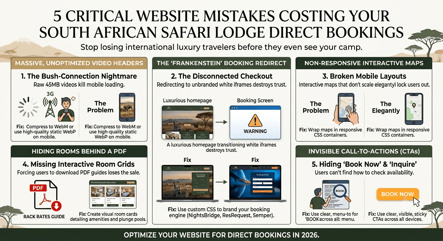
1. Massive, Unoptimized Video Headers (The Bush-Connection Nightmare)
There is nothing more spectacular than a sweeping drone shot of an elephant herd crossing the Olifants River at sunset. Naturally, you want to show this off on your home page. However, embedding a raw 45MB MP4 video header is the fastest way to kill your conversions.
While your marketing team might have super-fast fiber in Cape Town or Johannesburg, your actual operators, local agents, or guests looking for last-minute bookings are trying to load your site on a patchy 3G tower in the middle of the Sabi Sands or Hoedspruit. If your website takes longer than 3 seconds to load on a mobile device, Google's data shows that the probability of a bounce increases by over 90%.
The Fix: Convert large video headers to modern WebM formats, compress them aggressively, or replace them on mobile viewports with a beautiful, lightweight WebP static image that loads instantly.
2. The "Frankenstein" Booking Redirect
You have invested heavily in beautiful, high-end photography, custom typography, and gorgeous earth-toned brand design. But when a visitor decides to book and clicks your "Book Now" button, they are instantly redirected to a generic, unbranded, cold white iframe booking screen with a different domain name.
This massive disconnect in user experience destroys user trust. To an international traveler about to input their credit card details for a R150,000 reservation, this jarring transition feels like a security risk. If your checkout screen does not look exactly like your website, your cart abandonment rate will skyrocket.
The Fix: Use our specialized custom CSS overrides to style your reservation portals like NightsBridge, ResRequest, or Semper so they match your custom fonts, colors, and overall visual flow seamlessly.
3. Non-Responsive Interactive Maps
Where exactly is your lodge located? Can guests drive there in a 2WD vehicle? To answer these questions, many safari sites embed interactive maps or full PDF itineraries (like those built on Wetu). However, on mobile devices, these maps often break the site's layout, crop important details, or trap the user's finger scroll, preventing them from scrolling past the map.
Over 60% of all travel searches now happen on a smartphone. If your maps don't scale elegantly, you are locking out more than half of your potential client base.
The Fix: Wrap interactive elements in responsive CSS container wrappers that adjust dynamically to mobile screen dimensions while disabling touch-scroll propagation on mobile viewports. Explore our full range of booking integrations to see how we handle these responsive layouts.
4. Hiding Your Luxury Room Types Behind a PDF
High-paying safari travelers want to know exactly what they are paying for. If your website forces users to download a "2026 Rack Rates & Suite Guide" PDF just to see your room configurations, amenities, and floor plans, you have lost the sale. Travelers expect instant, interactive gratification.
The Fix: Create custom room-type grids directly on your site. Show visual comparison cards detailing beds, private plunge pools, outdoor showers, and dynamic "starting-at" pricing paths.
5. Invisible Call-to-Actions (CTAs)
If a user has to dig through your "Gallery" or navigate a complex menu tree just to figure out how to inquire or book, your design is working against your bottom line. Your "Check Availability" or "Book Now" options should be sticky, clearly defined, and visible on every single page—especially on mobile.
LET’S TALK
Have a project in mind after reading this? Send a brief and I usually reply within 24 to 48 hours.