NightsBridge Iframe Customization Guide: How to Style Your Booking Widget With Custom CSS
Your booking widget is the last thing a guest sees before they pay. Here's how to make your NightsBridge checkout look like it belongs to your brand, not a generic template.
A guest spends ten minutes falling in love with your lodge through beautiful photography, warm copy, and a story that feels like theirs. Then they click "Book Now" and land on a grey, boxed-in calendar that looks like it belongs to a different business entirely. That gap is where trust leaks out.
NightsBridge is a genuinely reliable booking engine, and reliability matters far more than looks when it comes to processing payments — we cover how it stacks up against ResRequest and Semper in our booking engine comparison guide. But out of the box, its default widget was never designed to match your brand. The good news: it does not have to look that way. With the right CSS approach, you can make the booking journey feel like a natural continuation of your site, not a hand-off to somebody else's software.
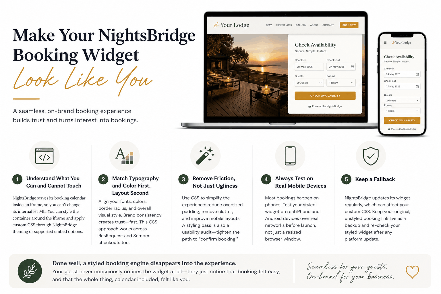
1. Understand What You Can and Cannot Touch
NightsBridge serves its booking calendar inside an iframe. That means you cannot directly rewrite its internal HTML from your own site's stylesheet, cross-origin restrictions prevent it. What you can do is style the container around the iframe, and in most NightsBridge setups, apply custom CSS through their own theming options or a supported embed configuration, which is exactly what our NightsBridge web design service specializes in.
2. Match Typography and Color First, Layout Second
The fastest way to make a booking widget feel native is the simplest: match your fonts and your color palette. Guests register brand consistency emotionally before they register it consciously. Get your primary and accent colors, your border radius, and your font family aligned, and the widget will already feel 80% more "yours." This is the same custom CSS approach we apply across ResRequest and Semper checkout paths too.
3. Remove Friction, Not Just Ugliness
While you are in the CSS, look for opportunities to simplify, not just decorate. Oversized default padding, redundant labels, and cramped mobile breakpoints all add friction. A styling pass is also a usability audit: use it to tighten the path between "check availability" and "confirm booking."
4. Always Test on Real Mobile Devices
Most safari and lodge bookings now happen on a phone, often over patchy hotel wifi or airport lounge connections. Custom CSS that looks polished on a desktop monitor can break completely on a small viewport. Test your styled widget on an actual iPhone and Android device before calling it done, not just a resized browser window.
5. Keep a Fallback
Because NightsBridge periodically updates its own widget markup, custom CSS built against a specific version can occasionally drift out of sync. Keep your original, unstyled booking link live somewhere as a fallback, and check your styled widget after any NightsBridge platform update.
Done well, a styled booking engine disappears into the experience. Your guest never consciously notices the widget at all, they just notice that booking felt easy, and that the whole thing, calendar included, felt like you.
LET’S TALK
Have a project in mind after reading this? Send a brief and I usually reply within 24 to 48 hours.