How to Reduce Cart Abandonment on FareHarbor and TrekkSoft Widgets
A guest adds a tour to their cart, then vanishes. Here's how to find and fix the friction points in FareHarbor and TrekkSoft checkouts that are quietly costing you completed bookings.
Somewhere between "add to cart" and "confirm booking," a meaningful share of your visitors simply disappear. They were interested enough to start. Something along the way convinced them to stop. For tour operators running FareHarbor or TrekkSoft, that gap is rarely about price, it is almost always about friction.
Both platforms are solid, well-built booking engines, but their default checkout experience was designed for broad compatibility across thousands of operators, not for your specific brand or your specific traveler. Closing that gap is largely a design and trust problem, which is the same territory our tour operator website work lives in.
1. Count Your Fields Before You Blame Your Price
Every additional form field between "select a time" and "pay" is another small reason to hesitate. Audit your checkout and ask honestly which fields are genuinely required versus which were left in from a default template. Redundant fields, like asking for a phone number twice in different steps, add friction with zero benefit.
2. Make the Total Price Visible Early
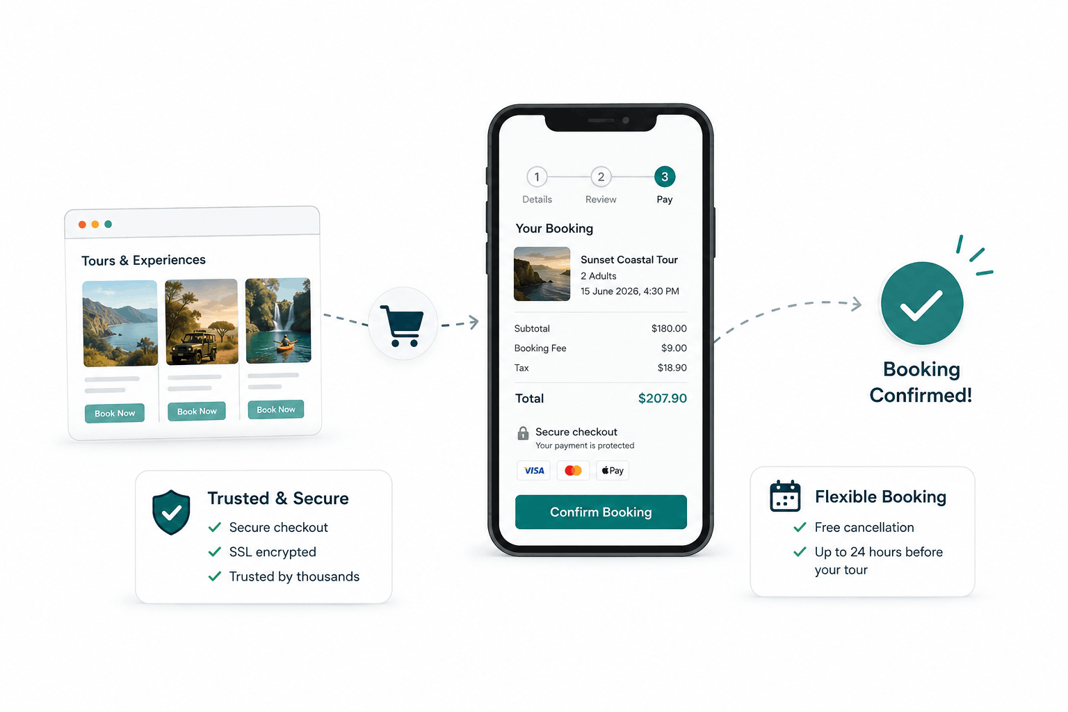
A visitor who does not see the full price, including any booking fees or taxes, until the very last step is a visitor primed to abandon at that exact moment out of sticker shock. Surface the full total as early in the flow as the platform allows, so there is no unpleasant surprise waiting at checkout.
3. Add Visible Trust Signals Near the Payment Step
The moment right before entering card details is when hesitation peaks. Small, visible trust signals nearby, a secure checkout badge, a clear cancellation policy, a note about who is actually processing the payment, measurably reduce hesitation at exactly this point.
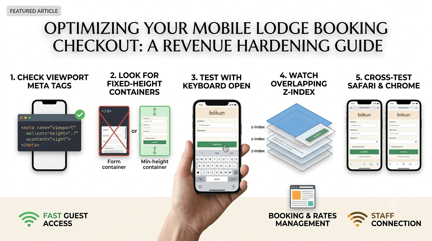
4. Fix Mobile Layout Issues Specifically
FareHarbor and TrekkSoft widgets both render differently across devices, and a checkout step that looks fine on a laptop can crowd or clip on a smaller phone screen. Since most tour bookings now happen on mobile, test the entire checkout flow on an actual phone, not just a resized browser window.
5. Follow Up on Abandoned Carts, But Do It Well
Both platforms offer some form of abandoned cart tracking. A single, well-timed follow-up email, sent within a few hours rather than days later, recovers a meaningful share of visitors who simply got distracted rather than deciding against booking.
Cart abandonment is rarely one big problem. It is usually several small ones stacked on top of each other. Fix the friction points one at a time, and the completed bookings tend to take care of themselves.
LET’S TALK
Have a project in mind after reading this? Send a brief and I usually reply within 24 to 48 hours.